


Web app · ASU Learning Engineering Institute

LEI researchers had 3 AI learning frameworks for responsible AI in teaching. I designed the web app that turns them into one guided workflow. I distilled input from 20+ focus group participants under its 8 themes and 24 criteria. My own QA pass logged 40+ design-QA findings against the build.
TEAM
Stakeholder · Product owner · Developer · Me
TIMELINE
Nov 2025 to May 2026
TOOLS
Figma · Asana
At a glance.
20+
across pilot and Community of Practice sessions
8
in the evaluation rubric
24
three per theme
3
in one guided workflow
40+
logged against the build
8
from the action-items document
Three frameworks, one product.
The AI-X Framework helps educators and designers plan and review AI-powered learning experiences. It brings three tools together. AI-X Compass helps people see where they stand in their AI project and where to start. AI-X Guide walks them through a structured evaluation of an existing tool, with reflection prompts along the way. AI-X Toolkit offers practical resources for each phase of the work.
The underlying research is dense. The evaluation alone has 8 themes. Each theme has three criteria, 24 in all. Every criterion is marked with one of 4 implementation statuses. The toolkit follows 5 Learning Engineering phases. PET mapping scores ideas on 4 dimensions: overall fit, pedagogy, experience, technology.
The frameworks existed only as research.
LEI researchers had built three research-backed frameworks for responsible AI innovation, but people couldn’t use them as one system yet. I started from the SRS document and listed what the product had to handle: how the three frameworks relate, the routing between them, the evaluation structure, a scenario-based entry and a way to save an evaluation and return to it.
A first-time visitor wouldn’t know how the frameworks relate to each other. Asking them to pick one on the first screen would stall them before they started.
Start from a goal.
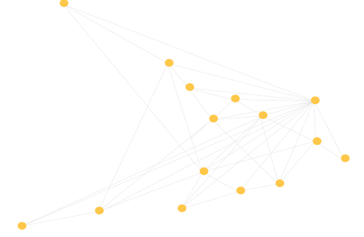
I designed the entry around what people want to do. They pick one of three goals, like shaping an idea or checking a prototype, and the site points them to the tools that fit.

Figure 1. The scenario-based entry, where two of the goals branch to more than one tool.
Working up from paper.
I sketched several structural layouts on paper before settling on a modular, guided system.

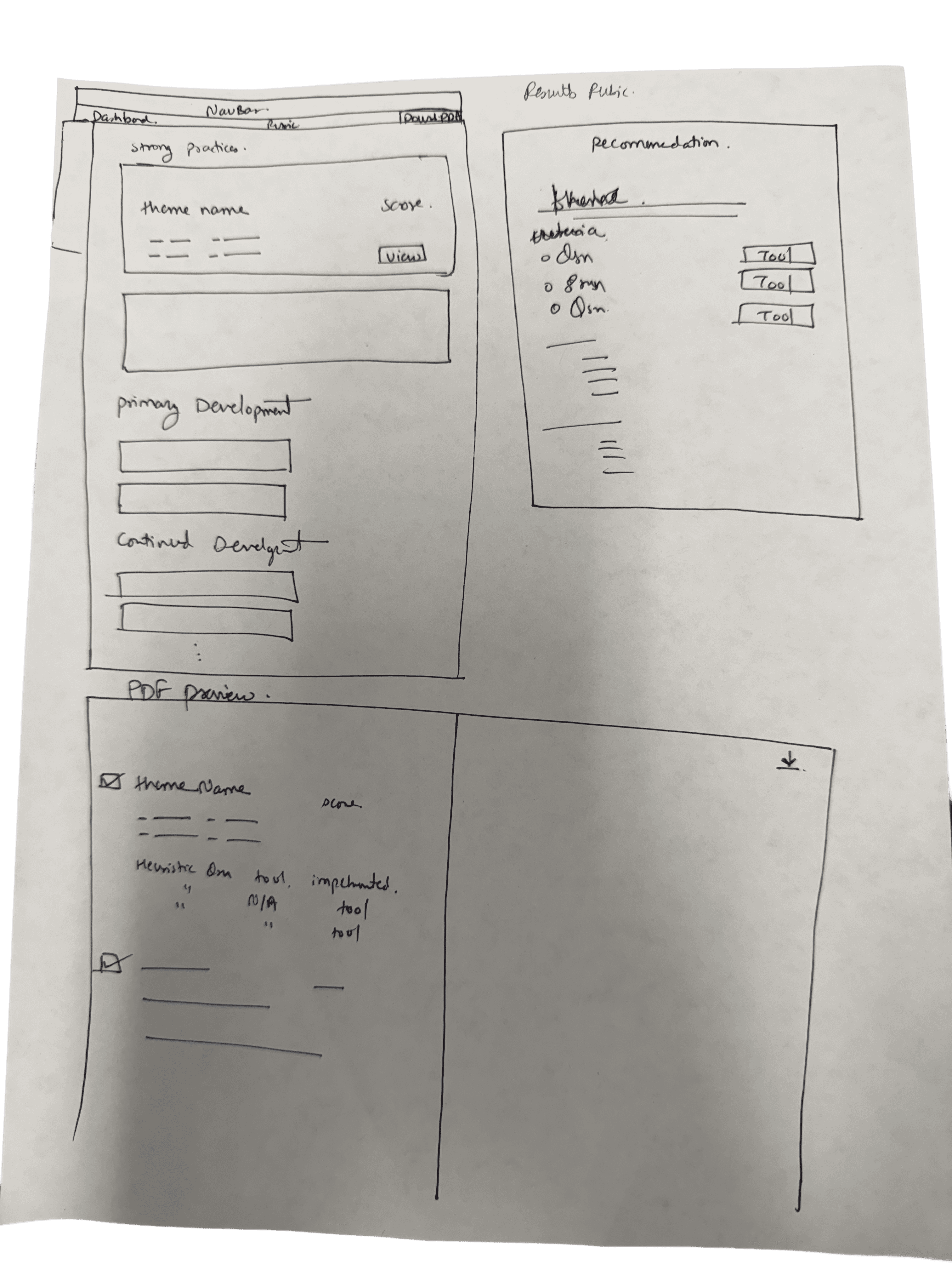

Figure 2. Paper sketches of the system layout, drawn before any wireframes.
The low-fidelity wireframes set the rules for the rubric: a clear hierarchy, accordions for dense criteria, themes in sequence, save-for-later, visible scoring feedback and a design for every criterion state.
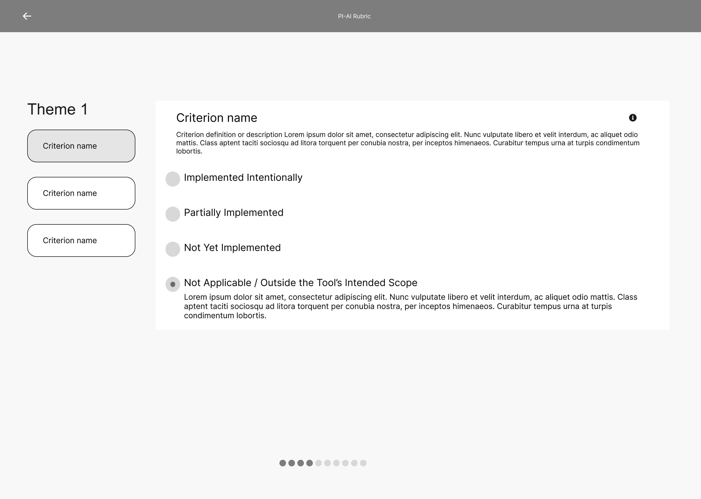

Figure 3. Two low-fidelity rubric screens, with criteria in accordions and a Save for Later button.
In high fidelity I designed each tool’s workflow and every rubric section, including the screens for PET ratings and score results. Export and resume logic followed, then the landing page.
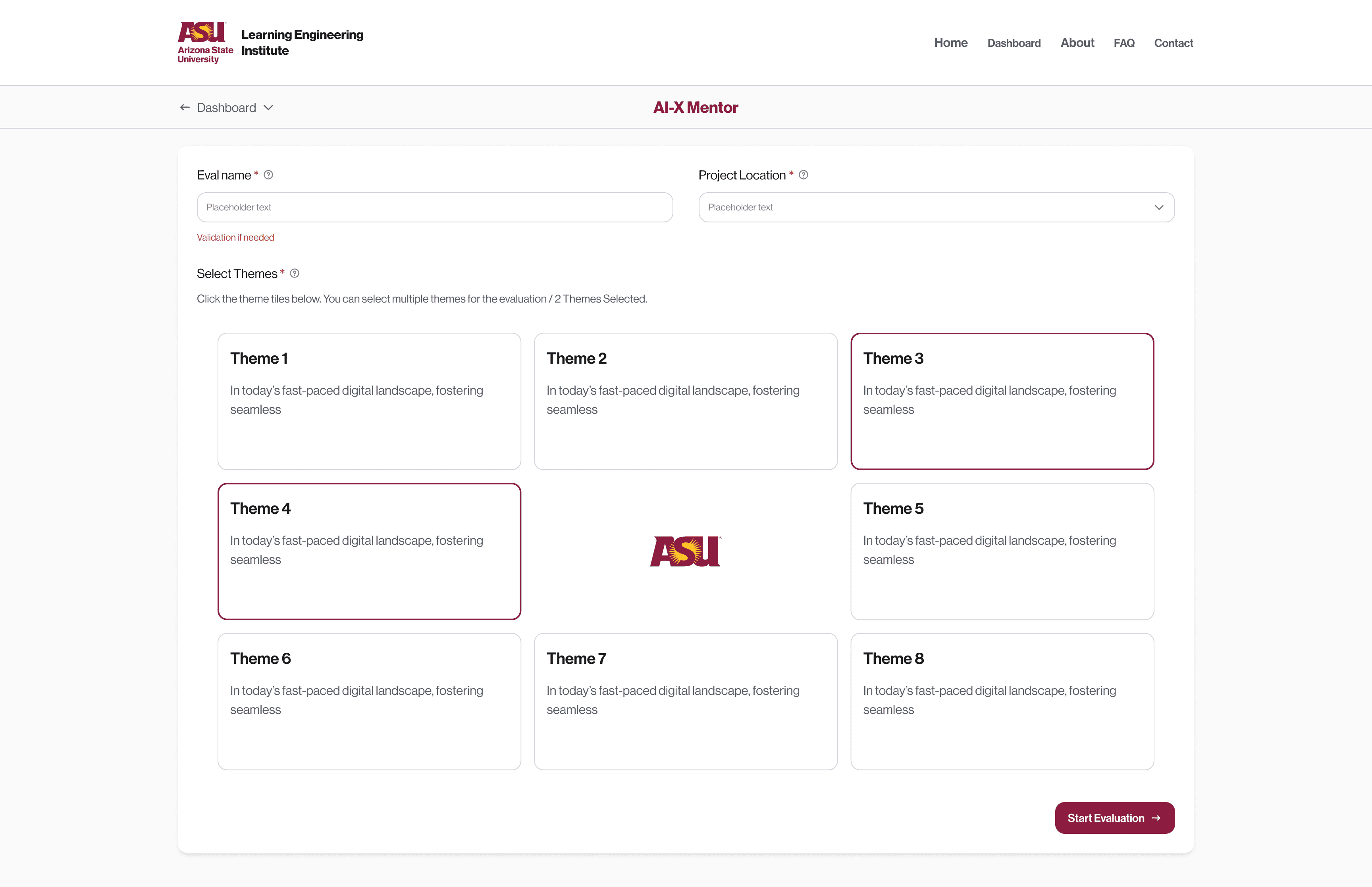
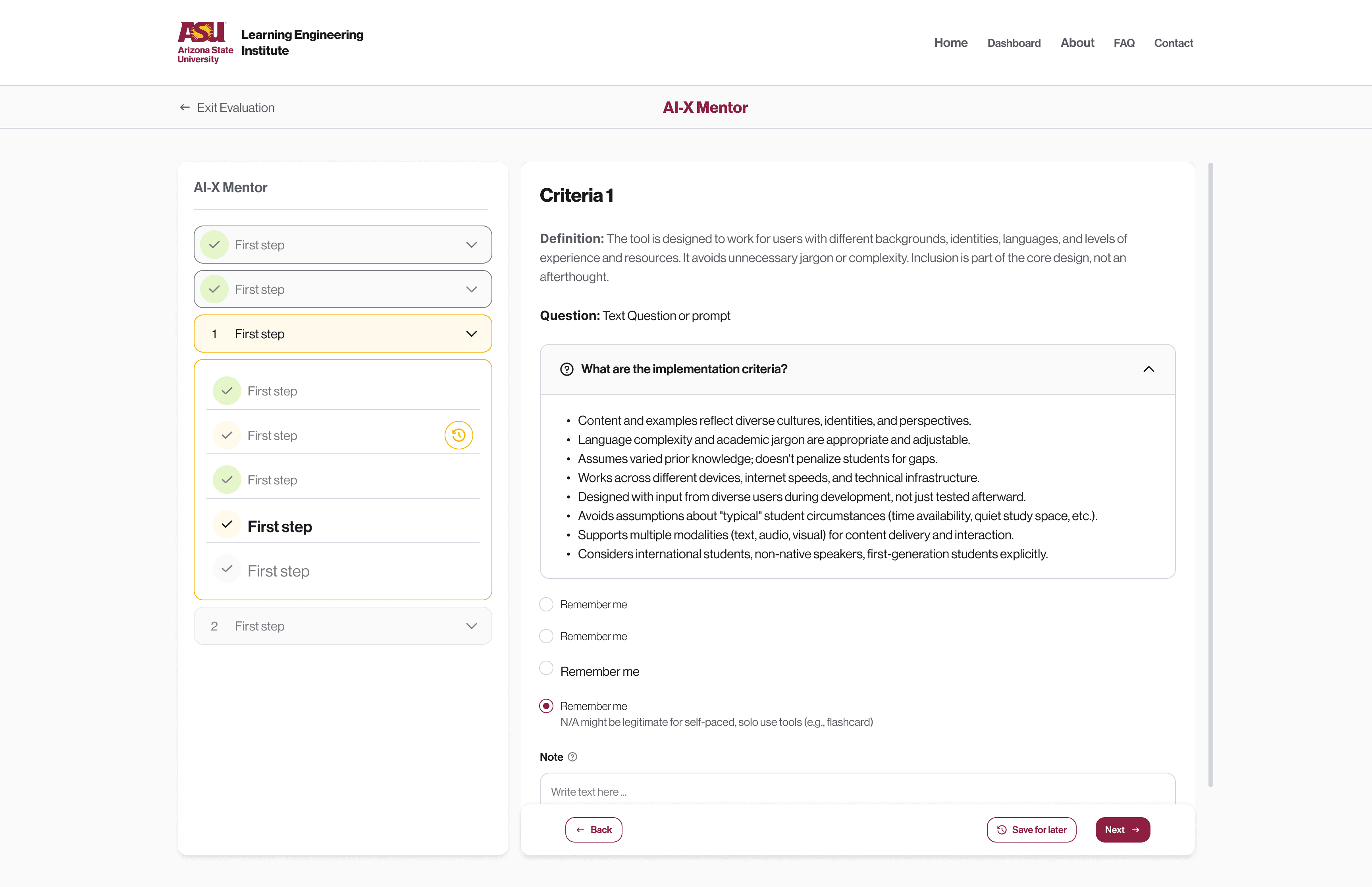
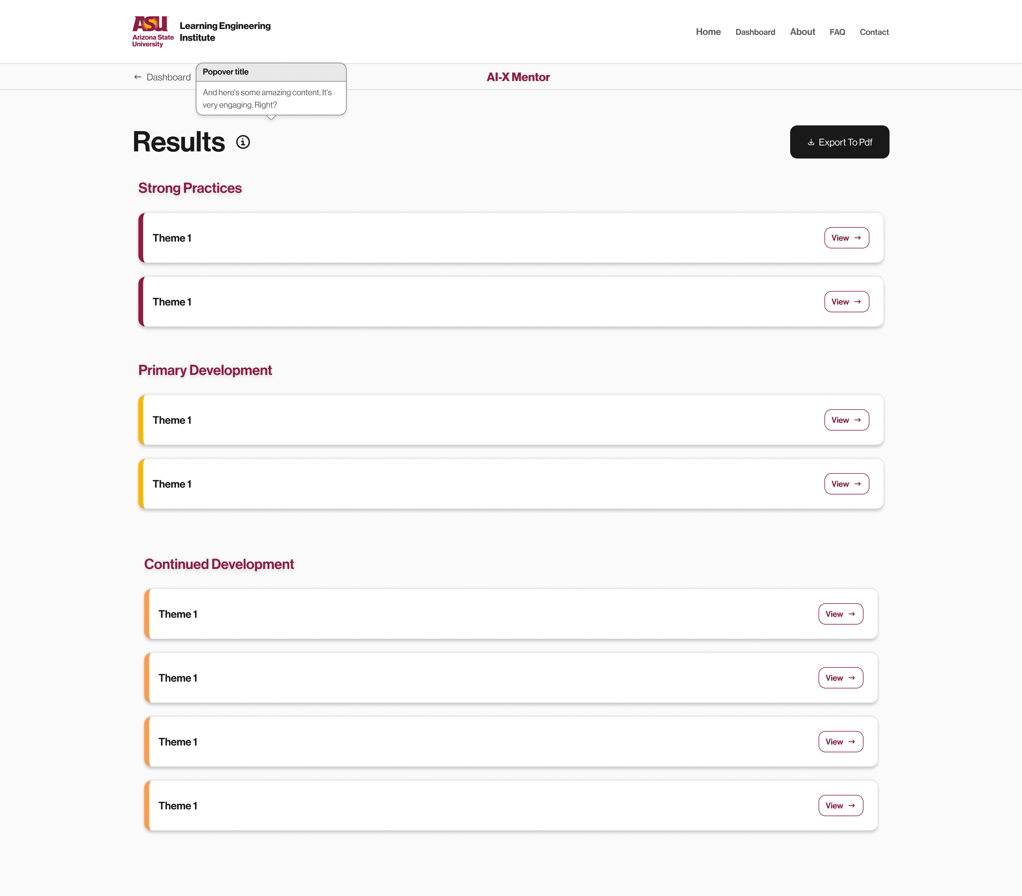
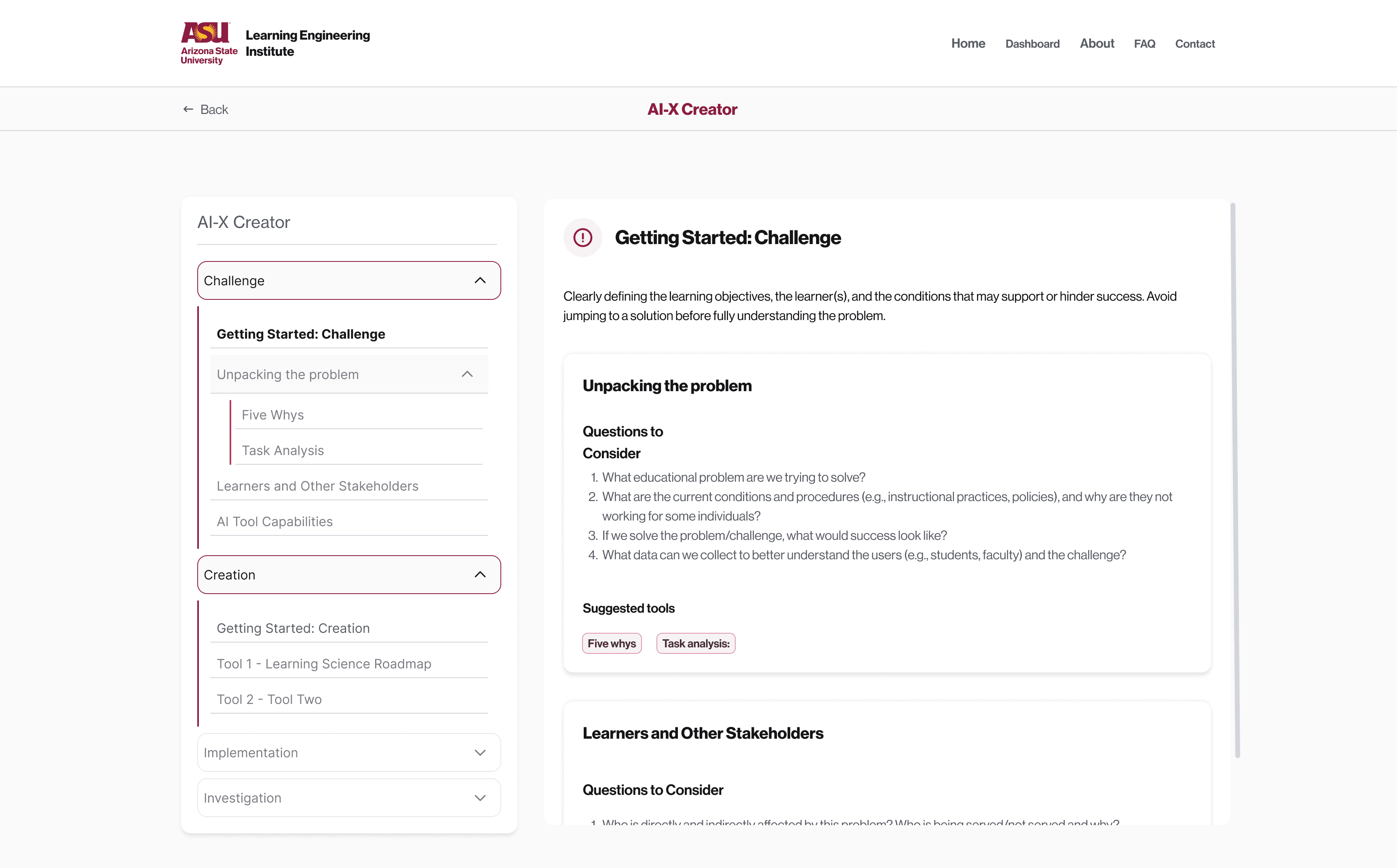
Figure 4. Four high-fidelity screens from the evaluation flow and the toolkit.
A dashboard for work in progress.
I added a dashboard so people can manage several evaluations, group them by project and pick up where they left off. Evaluations sit in project folders and move between them by drag and drop. Each one shows whether it’s completed or still in progress.
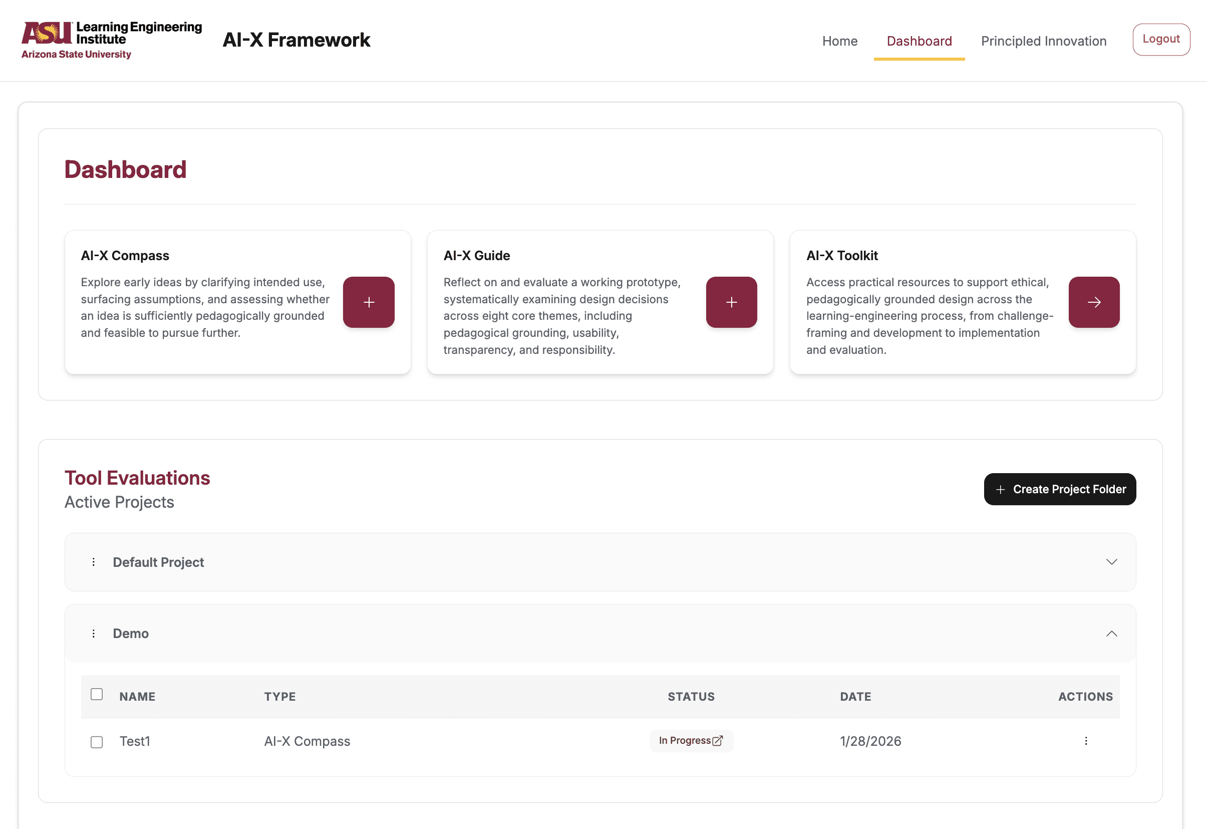
Figure 5. The dashboard with project folders and the status of each evaluation.
What the focus groups changed.
The team ran focus groups with 20+ participants across sessions, from a pilot in late September 2025 to Community of Practice sessions in spring 2026. Every piece of feedback went into one action-items document, with a High, Medium or Low priority vote and a developer note linking the pull request.
WHAT PARTICIPANTS SAID
WHAT SHIPPED
The Create Project button is difficult to find.
High. A Create Project button inside both evaluation flows, project made a required field, and the first folder opens on the dashboard.
Participants struggle to find their completed evaluations.
High. Evaluation Tools became Active Projects, with the first project folder open.
Can’t go back in the rubric to remove themes.
High. Themes became opt-in with clearer selection, and the back button became Exit evaluation, with a warning.
Eight changes came out of that document, each with a pull request reference. We declined a mobile layout, because the consensus was desktop first. De-selecting themes mid-evaluation was deferred, because it needed the evaluation deleted and recreated in the database.

Figure 6. Setting up an AI-X Guide evaluation: the project is a required field, and themes are opt-in cards that highlight when selected.
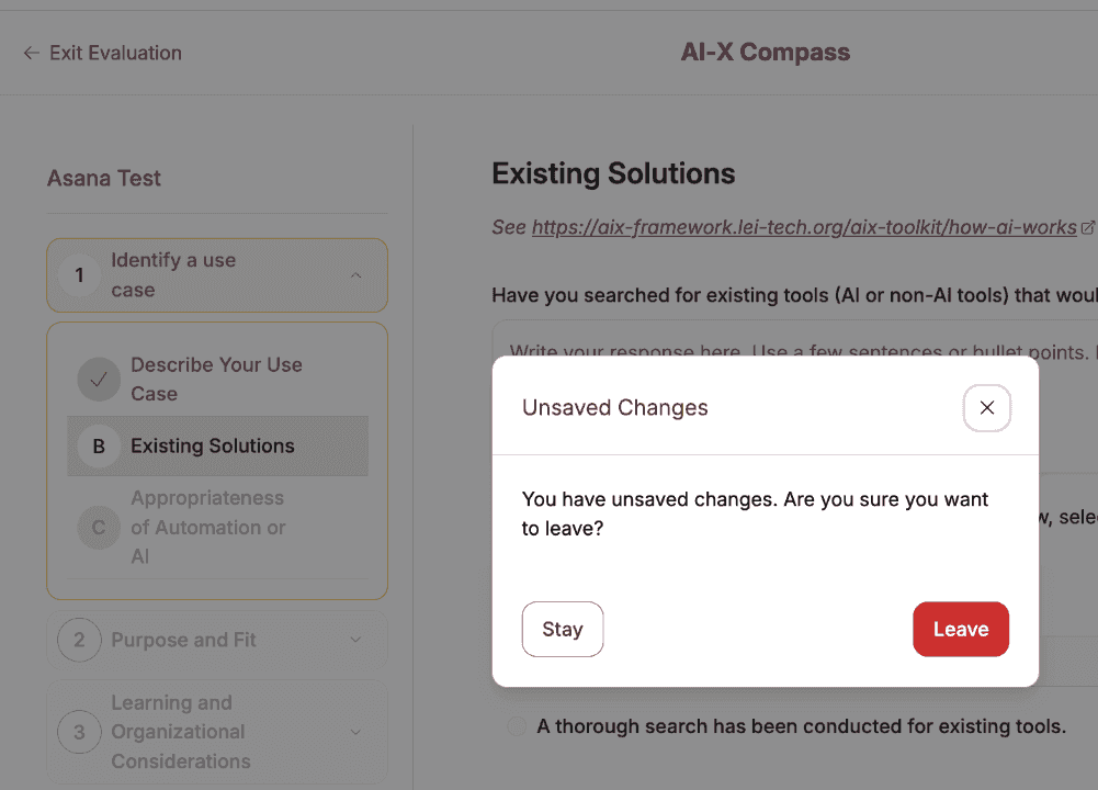
Figure 7. Exit evaluation asks before leaving, because going back mid-evaluation lost work.
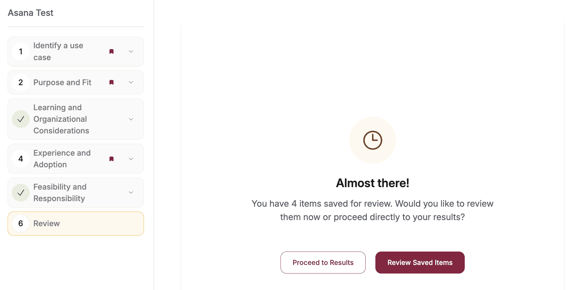
Figure 8. The review step at the end of an evaluation, where items marked for review wait before the results.
Design QA against the build.
I ran my own QA pass on the running app and logged 40+ design-QA findings in one document: 22 on the dashboard, 17 on the Compass and 4 on the rubric.
Most were about states and words. Selected and saved states looked alike in the sidebar, and the rubric’s selected state read as an error. One action went by three names, from mark for review to review saved items. On the Compass, the buttons moved when you clicked Previous Question several times fast, which breaks muscle memory on a 24-criteria pass.

Figure 9. From my QA doc: sidebar states for completed, current and marked-for-review sections, and the button row with one of the three names for the review action.
I tracked the focus-group fixes from their High, Medium or Low priority to the merged pull request. Then I wrote a 50-case verification suite in Asana, 18 cases on the Guide, 18 on the Compass and 14 on the dashboard. All 50 were closed by May 7, 2026.
Launched and live.
The AI-X Framework launched and is live on the LEI site.
Two choices carried most of the design. People start from a goal, and accordions keep every criterion readable without crowding the page.
Project takeaways.
Next case study
DADO, luxury gifting owned end to end
Read the case study →

Anchal Nagdev